The first Android 12 developer preview hit the streets Thursday, and we've played with it for a day. There's not a lot to see in this release—at least not at first. Most of the interesting bits are hidden, and the developer community is slowly enabling them. Many changes are half-finished alpha tweaks that will look different in the final release; after all, Google says these releases are for "testing and feedback."
This first release of Android 12 is meant to get some APIs and other changes in front of people for feedback, but it's also designed to not spill the beans too much on what the final build of Android 12 will look like. With that in mind, many of the features in an earlier Android 12 leak seem right on the money. This public release is a sanitized build with a lot of stuff turned off, but the more we flip on hidden flags and catch hints in the documentation, the more this build looks like a solid halfway point between Android 11 and those leaked Android 12 screenshots.
The notification panel
-
The top back bar is gone, all the colors are a little different (and bluer), and the background is less transparent.Ron Amadeo
-
More color differences in dark mode.Ron Amadeo
-
Google's developer docs show a design that looks more like the leaked photos.Google
-
Here is what the leak looked like. It used the same rounded corners as the developer docs do.
-
New options (which don't seem to work) for the persistent media player.Ron Amadeo
Google can never let an Android release go by without some notification changes, and this year it looks like we're getting a fresh design and a few other tweaks. Like everything else in the preview, we're only getting a half-finished look at things here.
There are a lot of color changes. In the shipping preview code, the notification panel picks a background color that has a strong blue tint to it compared to the pure white of Android 11. The turned-off quick settings buttons are blue now, too, instead of gray. If you turn on dark mode, you'll get a notification panel that is dark gray instead of black. It's suspicious that all the colors in this build seem a bit different, and the Android 12 leak we saw earlier hinted at totally customizable colors for everything (probably based on the wallpaper). All the color changes we're seeing now might be slightly strange defaults that will be changed before release. After all, changing colors is supposed to be very easy now.
As for other changes, app icons in the notification panel look different; they are usually totally white icons inside a colored circle. I think they're using the same artwork as the status bar icons now, which would add a nice bit of consistency.
There are new settings for the persistent media player notification that was introduced in Android 11. If you dig in to the settings, it looks like you can now ban individual apps from showing up in the persistent media player. There is a section called "Allowed apps" and a bunch of checkboxes; they just don't seem to do anything right now.
The ugly black bar at the top of the notification panel has been removed, and the background panel is more transparent. We hope Google changes this before the final release because the panel is currently so transparent that it's easy to confuse background app graphics with the notification panel. Some have speculated that we're missing a background blur. A new "RenderEffect" API actually makes it easy to blur elements.
If you look at Google's developer documents, you'll see a different notification design with more rounded corners, which matches up well with the leak.
The“Silky Home” settings
-
If you enable "Silky Home" you'll get this crazy new settings design. It's probably unfinished.Ron Amadeo
-
Just like on a Samsung phone, the header at the top gets bigger and smaller as you scroll. You can pull down the top of the list to reach it better.Ron Amadeo
-
Silky Home lines up perfectly with the leak.Ron Amadeo / XDA Developers
-
The order of options is different, some options have been split up, and the white space is out of control.Ron Amadeo
A lot of the interesting features of Android 11 are hidden things we aren't supposed to see yet. One of these fun additions is a hidden "Silky Home" flag for the settings, which was found by Android Authority's Joe Hindy and XDA's Mishaal Rahman. The feature flag makes the settings work a lot like they do on a Samsung phone, where a big header at the top of each list pushes the top of the list down so that it's easier to reach while using the phone one-handed. We praised this feature when it debuted on Samsung phones, and it's a good feature here as well. Hopefully, this will become the predominant list style on Android. It's yet another thing that lines up with the earlier Android 12 leak.
A lot of the release still seems broken, though. The main page of the settings doesn't have a heading that says "Settings," so instead of a proper title, the Silky Home flag seems to blow up the first bit of text it can grab ahold of. In this case, you get a huge "Explore Pixel Tips," which is normally part of a rotating carousel of settings suggestions. The actual settings list gets a ton of white space, and each entry loses all of its descriptive sub-text, which makes it harder to find settings.
There are three new sections now. "Apps & Notifications" is separated into "Apps" and "Notifications," and new sections "Styles & Wallpapers" and "Safety & Emergency" make an appearance. Styles & Wallpapers just fires up the existing home screen settings, where you can pick from wallpapers, icon shapes, and the icon grid layout. Many users probably have a problem finding this page via the normal method—long-pressing on a blank area of the home screen—so this seems like a good idea. The "Safety & Emergency" section, which is also available without the Silky Home flag, seems to just be the Pixel's Personal Safety app.
The order of the settings list is rearranged, and it looks like the list is being broken up into logical sections with white space. It really feels like the sections should get headings like they had in older versions of Android. Network & Connected Devices looks like the "connectivity" section. Apps, Notifications, and Digital Wellbeing are all app-related. The group with Battery Storage, Sound, and Display looks like the "Hardware" section, etc.
Reachability
Here's Android 12's one-handed mode - fully working. Sadly, it's like Apple's Reachability (vertically downsizing) rather than OHM on most OEM software (both horizontal and vertical downsizing). pic.twitter.com/IznRVHTgPu
— Mishaal Rahman (@MishaalRahman) February 18, 2021
It's not just settings that are prioritizing reachability. Rahman also found a hidden one-handed mode that seems to work the same way as it does in iOS. Once this feature is turned on, a swipe down in the gesture area will make the top of the screen shoot down, allowing you to better reach the controls.
Rahman also found another secret feature that turns a down-swipe gesture into a system-wide way to open the notification panel, another feature that saves users from reaching all the way to the top of the screen. Right now, it seems like you'll need to pick either the easy notification opening or the one-handed mode, since both features use the same gesture.
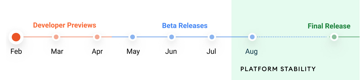
That's pretty much it for the major changes. It looks like Google is trying to save most of the big stuff for whatever form Google I/O takes later this year. As usual, there is an officially published timeline promising releases every month from here until at least August.
reader comments
72