This is episode #20 in a series examining modern CSS solutions to problems I've been solving over the last 13+ years of being a frontend developer. Visit ModernCSS.dev to view the whole series and additional resources.
Modern CSS gives us a range of properties to achieve custom select styles that have a near-identical initial appearance for single, multiple, and disabled select elements across the top browsers.
A few properties and techniques our solution will use:
-
clip-pathto create the custom dropdown arrow - CSS grid layout to align the native select and arrow
- custom CSS variables for flexible styling
-
emunits for relative sizing
Now available: my egghead video course Accessible Cross-Browser CSS Form Styling. You'll learn to take the techniques described in this tutorial to the next level by creating a themable form design system to extend across your projects.
Common Issues with Native Selects
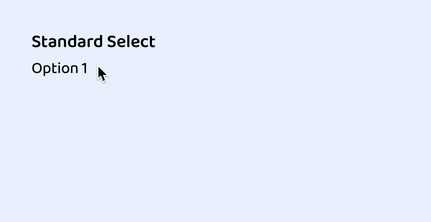
As with all form field types, <select> varies across browsers in its initial appearance.
From left to right, here is the initial appearance for <select> in Firefox, Chrome, and Safari:

The differences include box size, font-size, line-height, and most standout is the difference in how the dropdown indicator is styled.
Our goal is to create the same initial appearance across these browsers, inclusive of multiple selects, and disabled states.
Note: The dropdown list is still not stylable, so once the
<select>is opened, it will still pick up the individual browser's styles for theoptionlist. This is ok - we can deal with that to retain the free accessibility of a native select!
Base HTML
We'll focus on a single <select> to begin.
<label for="standard-select">Standard Select</label>
<div class="select">
  <select id="standard-select">
    <option value="Option 1">Option 1</option>
    <option value="Option 2">Option 2</option>
    <option value="Option 3">Option 3</option>
    <option value="Option 4">Option 4</option>
    <option value="Option 5">Option 5</option>
    <option value="Option length">Option that has too long of a value to fit</option>
  </select>
</div>
The label is not part of our styling exercise, but its included as a general requirement, notably with the for attribute having the value of the id on the <select>.
To accomplish our custom styles, we've wrapped the native select in an extra div with class of select for simplicity in this tutorial.
Reset and Remove Inherited Styles
As is included in all my tutorials as a modern best practice, we add the following reset first:
*,
*::before,
*::after {
  box-sizing: border-box;
}
Following that, we can begin the rule for the native select and apply the following to rest its appearance:
select {
  // A reset of styles, including removing the default dropdown arrow
  appearance: none;
  // Additional resets for further consistency
  background-color: transparent;
  border: none;
  padding: 0 1em 0 0;
  margin: 0;
  width: 100%;
  font-family: inherit;
  font-size: inherit;
  cursor: inherit;
  line-height: inherit;
}
While most of those are likely familiar, the oddball out is appearance. This is an infrequently used property and you'll note that it is not quite where we'd like it for support, but what it's primarily providing for us in this instance is the removal of the native browser dropdown arrow.
Note: The CodePen is set up to use autoprefixer which will add required pre-fixed versions of the
appearanceproperty. You may need to specifically set this up for your project, or manually add them. My HTML / Sass Jumpstart includes autoprefixer as part of the production build.
The good news is, we can add one more rule to gain removal of the arrow for lower IE versions if you need it:
select::-ms-expand {
  display: none;
}
This tip found in the excellent article from Filament Group that shows an alternate method to create select styles.
The last part is to remove the default outline. Don't worry - we'll add a replacement later on for the :focus state!
select {
  // ...existing styles
  outline: none;
And here's a gif of our progress. You can see there is now zero visual indication that this is a select prior to clicking on it:
Custom Select Box Styles
First, let's set up some CSS variables. This will allow our select to be flexibly re-colored such as to represent an error state.
:root {
  --select-border: #777;
  --select-focus: blue;
  --select-arrow: var(--select-border);
}
Accessibility note: As a user interface element, the select border must have a 3:1 contrast or greater against the surrounding surface color.
Now it's time to create the custom select styles which we will apply to the our wrapping div.select:
.select {
  width: 100%;
  min-width: 15ch;
  max-width: 30ch;
  border: 1px solid var(--select-border);
  border-radius: 0.25em;
  padding: 0.25em 0.5em;
  font-size: 1.25rem;
  cursor: pointer;
  line-height: 1.1;
  background-color: #fff;
  background-image: linear-gradient(to top, #f9f9f9, #fff 33%);
}
First, we set up some width constraints. The min-width and max-width values are mostly for this demo, and you may choose to drop or alter it for your use case.
Then we apply some box model properties, including border, border-radius, and padding. Note the use of the em unit which will keep these properties proportional to the set font-size.
In the reset styles, we set several properties to inherit, so here we define those, including font-size, cursor, and line-height.
Finally, we supply it background properties, including a gradient for the slightest bit of dimension. If you remove the background properties, the select will be transparent and pick up the page background. This may be desirable, however, be aware and test the effects on contrast.
And here's our progress:

Custom Select Dropdown Arrow
For our dropdown arrow, we are going to use one of the most exciting modern CSS properties: clip-path.
Clip paths let us make all kind of shapes by "clipping" the otherwise square and rectangle shapes we receive as defaults from most elements. I had fun using clip-path on my recent portfolio site redesign.
Prior to clip-path having better support, alternative methods included:
-
background-image- typically a png, slightly more modern would be an SVG - an inline SVG as an additional element
- the border trick to create a triangle
SVG may feel like the optimal solution, however when used as a background-image it loses the ability to act like an icon in the sense of not being able to alter its properties such as fill color without redefining it entirely. This means we cannot use our CSS custom variable.
Placing an SVG inline solves the fill color issue, however it means including one more element every time a <select> is defined.
With clip-path, we get a crisp, scalable arrow "graphic" that feels like an SVG but with the benefits of being able to use our custom variable and being contained in the style vs. the HTML markup.
To create the arrow, we will define it as an ::after pseudo-element.
.select::after {
  content: "";
  width: 0.8em;
  height: 0.5em;
  background-color: var(--select-arrow);
  clip-path: polygon(100% 0%, 0 0%, 50% 100%);
}
The clip-path syntax is a little strange, and since it's not really the focus of this article, I recommend the following resources:
- Colby Fayock explans the syntax with an example in this egghead video
-
Clippy is an online tool that allows you to select a shape and adjust the points while dynamically generating the
clip-pathCSS
If you're following along, you may have noticed the arrow is not appearing despite defining width and height. When inspected, its found that the ::after is not actually being allowed it's width.
We will resolve this by updating our .select to use CSS grid layout.
.select {
  // ...existing styles
  display: grid;
}
This lets the arrow appear by essentially extending it a display value akin to "block".

At this stage we can verify that we have indeed created a triangle.
To fix the alignment, we'll use my favorite CSS grid hack (old hat to you if you've read a few articles around here!).
Old CSS solution: position: absolute
New CSS solution: A single grid-template-areas to contain them all
First we'll define our area, then define that the select and the ::after both use it. The name is scoped to the element its created for, and we'll keep it easy by calling it "select":
.select {
  // ...existing styles
  grid-template-areas: "select";
}

select,
.select:after {
  grid-area: select;
}
Which gives us an overlap of the arrow above the native select due to stacking context via source order:

We can now use grid properties to finalize the alignment of each element:
.select {
  // ...existing styles
  align-items: center;
}

.select:after {
  // ...existing styles
  justify-self: end;
}
Ta-da!

:focus State
Oh yeah - remember how we removed the outline? We need to resolve the missing :focus state from dropping that.
There is an upcoming property we could use called :focus-within but it's still best to include a polyfill for it at this time.
For this tutorial, we'll use an alternate method that achieves the same result, just a bit heftier.
Unfortunately, this means we need to add one more element into the DOM.
After the native select element, as the last child within .select, add:
<span class="focus"></span>
Why after? Because since this is a pure CSS solution, placing it after the native select means we can alter it when the select is focused by use of the adjacent sibling selector - +.
This allows us to create the following rule:
select:focus + .focus {
  position: absolute;
  top: -1px;
  left: -1px;
  right: -1px;
  bottom: -1px;
  border: 2px solid var(--select-focus);
  border-radius: inherit;
}
You may be wondering why we're back to position: absolute after just learning the previous grid-area hack.
The reason is to avoid recalculating adjustments based on padding. If you try it on your own, you'll see that even setting width and height to 100% still makes it sit within the padding.
The job position: absolute does best is matching the size of an element. We're pulling it an extra pixel in each direction to make sure it overlaps the border property.
But, we need to make one more addition to .select to ensure that it's relative to our select by - well, position: relative.
.select {
  // ...existing styles
  position: relative;
And here's our custom select all together as seen in Chrome:

Multiple Select
Selects come in a second flavor, which allows a user to select more than one option. From the HTML perspective, this simply means add the multiple attribute, but we'll also add a class to help create style adjustments called select--multiple:
<label for="multi-select">Multiple Select</label>
<div class="select select--multiple">
  <select id="multi-select" multiple>
    <option value="Option 1">Option 1</option>
    <option value="Option 2">Option 2</option>
    <option value="Option 3">Option 3</option>
    <option value="Option 4">Option 4</option>
    <option value="Option 5">Option 5</option>
    <option value="Option length">Option that has too long of a value to fit</option>
  </select>
  <span class="focus"></span>
</div>
And looking at it, we can see it's inherited most of our styles favorably, except we don't need the arrow in this view.

This is a quick fix to adjust our selector that defines the arrow. We use :not() to exclude our newly defined class:
.select:not(.select--multiple)::after
We have a couple of minor adjustments to make for the multiple select, the first is removing padding that was previously added to make room for the arrow:
select[multiple] {
  padding-right: 0;
}
By default, options with a long value will overflow visible area and be clipped, but I found that the main browsers allow the wrapping to be overridden if you desire:
select[multiple] option {
  white-space: normal;
}
Optionally, we can set a height on the select to bring a bit more reliable cross-browser behavior. Through testing this, I learned that Chrome and Firefox will show a partial option, but Safari will completely hide an option that is not able to be fully in view.
The height must be set directly on the native select. Given our other styles, the value 6rem will be able to show 3 options:
select[multiple] {
  // ...existing styles
  height: 6rem;
}
At this point, due to current browser support, we have made as much adjustments as we are able.
The
:selectedstate of theoptionsis fairly customizable in Chrome, somewhat in Firefox, and not at all in Safari. See the CodePen demo for a section that can be uncommented to preview this.
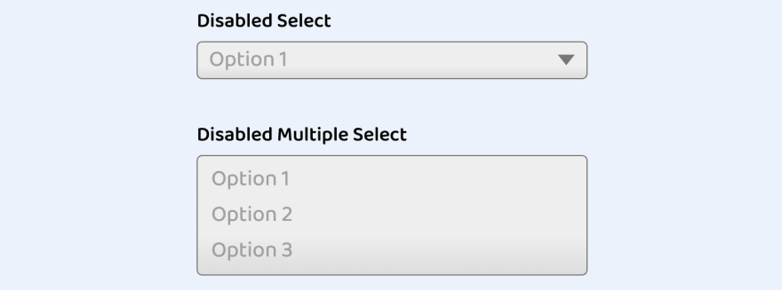
:disabled Styles
While I would advocate for simply not showing disabled controls, we should prepare the styles for that state just to cover our bases.
To emphasis the disabled state, we want to apply a greyed background. But since we've set background styles on .select and there isn't a :parent selector, we need to create one last class to handle for this state:
.select--disabled {
  cursor: not-allowed;
  background-color: #eee;
  background-image: linear-gradient(to top, #ddd, #eee 33%);
}
Here we've updated the cursor as an extra hint that the field cannot be interacted with, and updated the background values we previously set to be white to now be more grey for the disabled state.
This results in the following appearances:
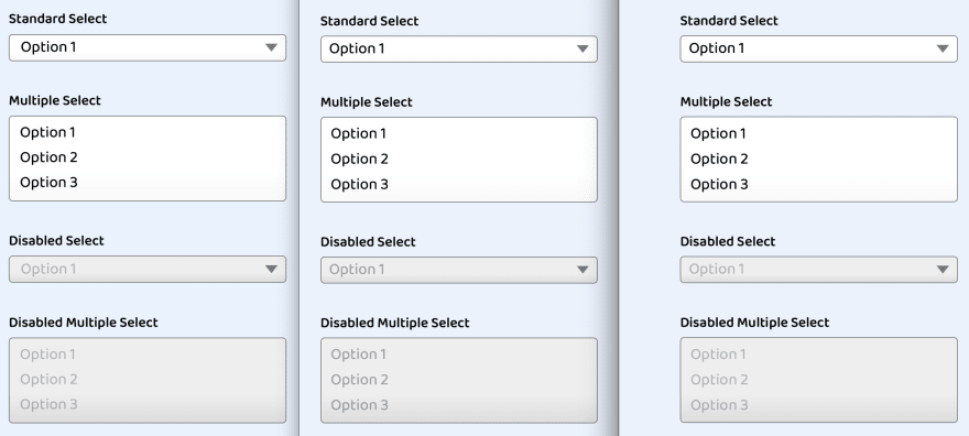
Demo
You can test it for yourself, but here's a preview of the full solution across (from left) the Firefox, Chrome, and Safari:


Top comments (11)
This is a really great explanation and walkthrough!
After recently being tasked with creating a custom
selectcomponent for a large React application, I can whole-heartedly appreciate a pure CSS approach.Thanks!
Stephanie;
Is there any way to style the option hover property to change color from blue to other color?
For the multiple select you can change it for Chrome and Firefox but currently it has no effect on Chrome. The CodePen has an example of how to do it! Let me know if I misunderstood your question!
Thanks Steph, that's what I found, Chrome doesn't allow it to happen. Just another reason to avoid 3rd party libraries that do it in other ways as it locks into using them. Not all bad if that component is simple and easy to use.
Fantastic, styling select boxes can get confusing. I will definitely reference this next time I need to do so.
Awesome, thanks!
I like these! They will be helpful while creating a new project from where we need custom select styles!
Yay! I left the initial style very basic but you can really customize it from this starting point 🚀
What a nice set of blogs you have written. A joy to read, and I learn neat tricks everytime. Thank you for sharing your knowledge! 🥳
Thanks for letting me know you find these articles useful! 🙌