
For years, development stacks of web developers almost certainly included one of the “Great Three” of JavaScript frameworks – React, Angular, Vue. These frameworks are still wildly popular and continue evolving, but it is useful for coders to have more alternative options to choose from. Results of the latest State of JS survey imply that there is a new rising star on the JavaScript landscape – Svelte.
Currently, I’m working on a demo project management app based on Svelte. Taking into account the fact that Svelte has been attracting the most serious attention from the development community for just a few years, I thought that I would have to do all the coding part from scratch. But fortunately, I’ve managed to find a lot of UI libraries and even a Gantt component that can be used to make my first coding experience with Svelte more effective and less time-consuming. In this article, I want to share my findings with you.
But first, we should become familiar with this promising framework.
What is Svelte and Why to Use It
Svelte is a relatively new component-based JavaScript framework with a powerful reactivity system at its core. It delivers a fresh approach to building super-fast web applications. In contrast to React and Vue.js that interpret application code when it is running in the user's browser, Svelte operates as a compiler and turns your declarative code into pure JavaScript during the build phase. Svelte automatically updates the DOM when the application’s state changes instead of relying on the virtual DOM diffing. As a result, Svelte allows creating applications with impressive performance rates by writing less code.
IBM, Philips, GoDaddy, New York Times, and many other companies of various scales have already started using Svelte. It is also a beginner-friendly framework, as basic knowledge of web technologies (HTML, CSS, JS) will be enough to start working with Svelte.
Now let us proceed with the overview of ready-made UI tools that can be used to speed up the development of Svelte-based applications.
DHTMLX Gantt for Svelte
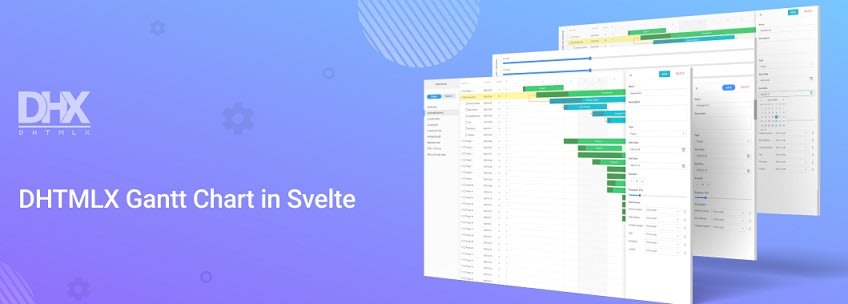
If you are looking for an easy way to build a project management application based on a Gantt chart functionality, DHTMLX Svelte Gantt is exactly what you need. Actually, it is a key component of my demo project. Written in pure Svelte, this brand-new library enables you to build Gantt charts for conveniently planning, managing, and monitoring tasks in projects of any size.
The main feature of this native Svelte Gantt is its reactivity. It ensures that any editing operations or chart timeline manipulations are displayed with no delay. The component is also notable for its great performance characteristics. Projects with even 10000+ tasks are rendered in just milliseconds without causing any inconvenience to end-users.
This Svelte Gantt comes with a set of key capabilities for organizing the workflow. For instance, it is possible to set different types of tasks (project, task, milestone) and specify dependencies between them. You can also make the Gantt timeline more informative by adding task tooltips and vertical markers. An intuitive drag-and-drop UI makes it really easy for users to interact with the chart. All relevant data on each project task can be changed on the fly via an edit form.
An extensive API of this Gantt component provides vast customization possibilities, enabling you to tune all Gantt elements to the guidelines of your project. You are also free to complement tasks with custom HTML content, enable read-only mode, or even place several Gantt charts on one page.
If you decide to try DHTMLX Svelte Gantt in your project, just download an evaluation version from npm and put it to use. Multiple demos will help you to make the most of this Gantt component much faster.
Package size: 185 kB
License: Commercial
NPM: https://www.npmjs.com/package/@dhtmlx/trial-svelte-gantt
Svelte Material UI
Svelte Material UI (SMUI) is a library of Svelte 3 UI components (20+) with touch/mobile-optimized design intended for generating a wide range of interface elements. It is based on the Material Design Components (MDC) for Web that aid in implementing Material Design.
SMUI offers helper utilities for creating custom UI components if the given list of components is not covering your needs. All components can be enriched with arbitrary attributes and actions. All events from every component are forwarded. Here we are talking about DOM, MDC, and custom events. The support for various event modifiers is also included.
SMUI components are fully themable, meaning that you can define every aspect of their visual appearance with the help of Sass variables or bare CSS. All components can be adjusted for the use of text content written in RTL languages. SMUI is also accessible by default for people with disabilities.
We can conclude that the library is rapidly gaining popularity among web developers, as it has already found application in more than 500 projects.
Package size: 45.6 kB
License: Apache 2.0
GitHub stars: 1.6k
Smelte
Smelte is a UI component library based on the combination of Svelte and Tailwind CSS. It offers a collection of Material design components (20+) aimed to help developers in creating nice-looking and responsive layouts. Tailwind's utility classes are used as the main instrument for building Smelte components, while Svelte takes care of performance and bundle size.
The library offers a lot of helpful features. For instance, there is a PurgeCSS tool that serves to automatically detect and remove all unused classes from your CSS, thus reducing the size of CSS files in your project. The image lazy loading feature allows displaying quality images in your app without causing any performance penalties. The list of other useful capabilities includes JS/CSS ripple animation, SSR deployment, custom themes, material icons, dark mode, and many others.
Package size: 948 kB
License: MIT
GitHub stars: 911
Carbon Components Svelte

Carbon is a well-known design system launched by IBM for facilitating design and development processes. Core parts of the system are also implemented by the IBM team for native coding experience with popular JavaScript libraries. Carbon Components Svelte is one of these solutions.
This library is packed with a set of reusable Svelte UI components (50+) for solving specific UI problems. Adopting the library allows you to benefit from consistent markup, styles, and behavior in Svelte projects. Carbon Components Svelte also makes use of the sveld library for automatically generating TypeScript definitions and API metadata.
The Carbon Svelte portfolio also includes three other useful libraries for Svelte applications: Carbon Icons (6000+), Carbon Pictograms (700+), Carbon Charts (16). These libraries can be utilized independently or in combination with Carbon Components Svelte.
Package size: 2.14 MB
License: Apache 2.0
GitHub stars: 773
Svelte Materialify
Svelte Materialify is a UI library designed to boost the development process with Svelte. It provides web developers with handcrafted Material Components they need to build rich and engaging user interfaces. Currently, the library includes 50+ components that help to implement key UI elements such as grid, forms, menus, buttons, tooltips, and many others.
All components are customizable, thus they can be modified to fit in various use cases. If you have your own style for Materialify components in mind, it is possible to create custom components. Support for server-side rendering facilitates improved performance. The library is also notable for its full accessibility.
The library is still in progress, but in the future, it may start playing the same role for Svelte as Vuetify plays for Vue.js.
Package size: 2.38 MB
License: MIT
GitHub stars: 437
Sveltestrap
When it comes to web design issues in Svelte apps, some developers may choose to use well-known Bootstrap components. It is possible, but the problem here is that many of these components should come with jQuery and it will increase the app’s bundle size. That is where the Sveltestrap library can come in handy.
This library helps to reimplement Bootstrap components as Svelte components. It frees you from the necessity to directly apply Bootstrap component classes or include Bootstrap's JS code. Sveltestrap components do not cause any difficulties in terms of their usage, as they require less markup. Creators of this component borrowed some concepts from the reactstrap library for React.
At the same time, it should be noted that Sveltestrap has no Bootstrap styles, so it is necessary to add a link to the Bootstrap 4 stylesheet to your project.
Package size: 1.14 MB
License: MIT
GitHub stars: 574
Attractions
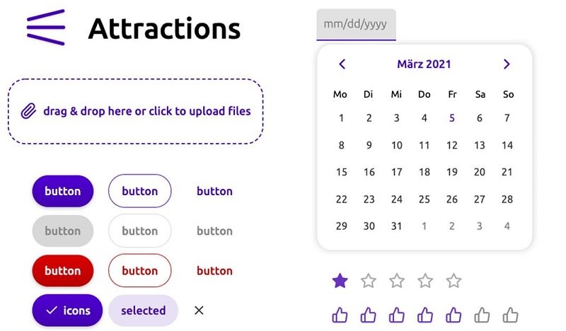
Attractions is a robust package of UI components designed for accelerating the process of implementing various interface parts in Svelte apps. Currently, it includes 46 customizable components and a collection of utility functions for making your coding more productive. Thanks to the compiling nature of Svelte, the library can be applied for any framework using the JS API.
All styling changes in Attractions components are performed with classes and Sass variables. By utilizing the Custom Elements API, it is also possible to employ Attractions components as Web Components. It can be very helpful in cases when you want to make a quick prototype without using any frameworks or bundlers.
Package size: 875 kB
License: MIT
GitHub stars: 203
SvelteChota
Small bundle sizes is one of the key benefits that motivate web developers to start web projects with Svelte. This idea lies at the heart of SvelteChota - a kit of UI components based on the Chota CSS framework. This framework is mainly notable for its lightweightness, adding only about 3kb of gzipped code to your bundle. SvelteChota includes a range of basic components (10+) that can be customized with CSS variables. There are also helpful CSS classes for modifying the style of any element. This demo page shows how standard HTML elements look with Chota.
Package size: 110 kB
License: MIT
GitHub stars: 177
Notus Svelte

Notus Svelte is a free-to-use UI Kit and Admin built on top of Tailwind CSS and Svelte by Creative Tim. By choosing Notus Svelte, you get access to 120 Fully Coded CSS elements and 18 dynamic components to kickstart your UI development. These components can be mixed and matched to help you go through stages from prototyping to full-functional code with less effort. The appearance of all components can be adjusted to your needs with the help of Tailwind CSS classes and custom classes. You can also use ready-made example pages to get started with Notus Svelte.
Package size: 6.65 MB
License: MIT
GitHub stars: 168
Svelthree

Three.js is a widely used JavaScript library for creating and displaying 3D content in the browser. If you want to do the same in Svelte projects, pay attention to Svelthree. The key objective of this components library is to provide Svelte developers with an API similar to the one of three.js. Taking advantage of this library, you can build reactive and reusable three.js scene graphs in a declarative manner.
The code of all components is written in TypeScript. There are also some useful examples prepared by the development team to cover the library’s API in more detail. But it should be mentioned that this library is still under development and many features are yet to be added.
Package size: 2.24 MB
License: MIT
GitHub stars: 158
Felte
Form is the key interface element when it is necessary to get important information from end-users. Therefore I devoted some time to find a good library for implementing this functionality for Svelte and came across Felte. It is a user-friendly and extensible form library based on Svelte stores and actions that allow you to build forms exactly the way you need.
Validation is an essential part of any form component, that is why Felte offers you to apply popular validation libraries (such as Yup, Zod, or Superstruct) or create a custom validation strategy. It also provides various built-in error reporting capabilities. When talking about styling options, Felte relies on plain HTML tags rather than CSS variables, making your work on styling adjustments easier.
Package size: 243 kB
License: MIT
GitHub stars: 74
Svelte Mapbox
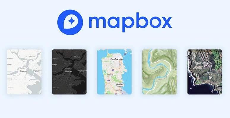
If you need to build an interactive map with server-side rendering support for your Svelte project, Svelte Mapbox can be a good helper for completing this kind of task. Based on a popular Mapbox library, this lightweight mapping tool provides you with map and place geocoding (place autocomplete) components. You can also add custom Svelte components to your map and modify any map elements with the use of custom CSS. But it is necessary to emphasize that the place autocomplete component has a client-side dependency since it increases the bundle size (by about 0.5 MB) and the build time if bundled.
Package size: 52.4 kB
License: MIT
GitHub stars: 120
Svelte Calendar
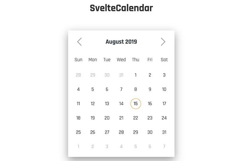
Svelte Calendar is a convenient cross-browser datepicker component with neat animations that allows end-users to view and select dates. It renders well on mobile devices of various sizes and can be easily navigated with a thumb or via keyboard. Svelte Calendar allows you to limit the selection range by specifying start and end dates and theme a datepicker. You can employ it as a Svelte component, with vanilla JavaScript, or compile it into a native web component.
Package size: 1.51 MB
License: MIT
GitHub stars: 292
Svelte-Grid
Svelte-Grid is a handy grid layout system with responsive breakpoints that allows you to arrange all the stuff on a web page in a well-structured way. It is a pure Svelte component without any dependencies on jQuery or 3-rd party tools. Here you get static, draggable, and resizable widgets to implement your page design faster. The component also comes with some helper functions that will help you to manage grid elements more efficiently. It can also be rendered on the server thanks to the compatibility with the Sapper framework.
Package size: 179 kB
License: MIT
GitHub stars: 490
Final Words
The only thing that may discourage you from trying Svelte is its immaturity when compared to the mainstream frameworks. It is true that Svelte is a young framework, but as you can see there is a variety of existing UI tools that can help to get started with Svelte. And I think that the ecosystem of this remarkable framework will continue to evolve and become more developer-friendly in the coming years. If you have in mind any other useful UI solutions for building Svelte apps, feel free to share them in the comments below.


Top comments (8)
Another one... svelteui.org/
There are also beautiful illright.github.io/attractions/ and svelte-atoms.web.app Both of them in production. Worth checking them out
You might like AgnosticUI which has a Svelte package:
AgnosticUI—One stylesheet…all the frameworks—agnosticui.com Easily build design systems that work in React, Vue 3, Angular, and Svelte! - Semantic and accessible HTML - Unprocessed decoupled CSS - One stylesheet per component propagates to all framework implementations - Synchronized theming via CSS custom properties
this one should be on the list
daisyui.com/
I have been looking around for svelte-ui libraries 😅😅. Thanks for posting this.
Awesome list! I think that Flowbite Svelte also deserves a mention :)
Very helpful - thanks!
This is an old article but STWUI is an up and coming UI library for Svelte with 50+ components! stwui.vercel.app/