In this guide, we’ll tell you all about GTmetrix History Graphs and how to use them.
Overview
GTmetrix users can view past reports generated through their account by opening any report and navigating to the History tab.
The History tab provides History Graphs to visualize your historical data as well as other options to keep track of your webpage’s performance.
In this guide, we’ll show you all the different ways in which you can use History Graphs.
Dashboard Report Table
Before we discuss History Graphs in detail, let’s take a look at the basic Dashboard Report Table functionality (logged-in users only).
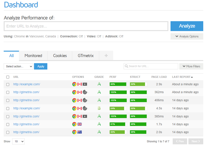
Each row of the Dashboard Report Table displays the Last Report generated for a URL and the Analysis Options used in the test.
Here’s how the Dashboard Report Table behaves:
- Successfully analyzing a page for the first time will insert a new row for that particular URL/Analysis Options combination.
- Testing the same page with different Analysis Options will insert a new row for that particular URL/Analysis Options combination.
- Re-Testing the page with the same Analysis Options will overwrite the previous Last Report on that particular row.
More Dashboard Report Table functionality is detailed in our How to Organize Reports with Dashboard Filters article.
History Graph Basics
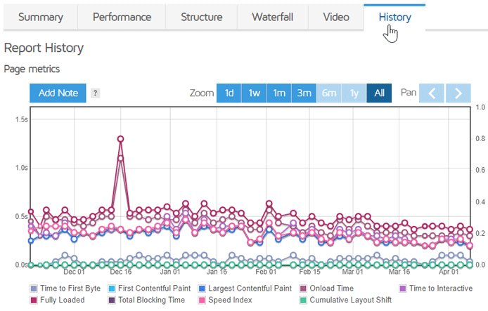
In order to see a report’s History Graph, view a report and click on the History tab.
Note that you must have tested a page at least twice in order to generate report history for that page.
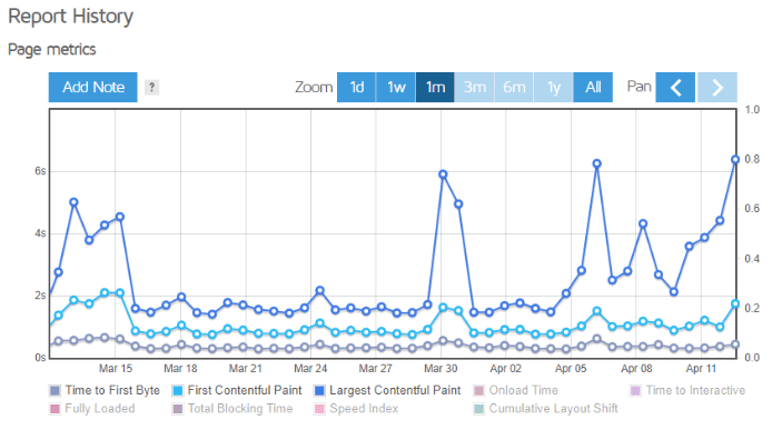
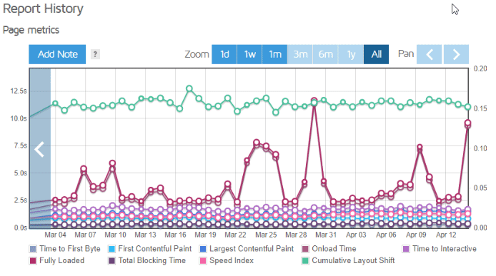
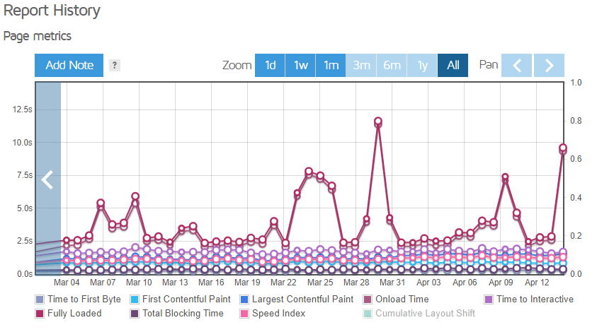
Available History Graphs
The History tab provides three graphs to visualize the historical report data. They are:
- Page metrics graph – Displays 9 major metrics (e.g., TTFB, LCP, TTI, etc.).
- Page sizes and request counts graph – Displays your page size and total number of requests.
- Page scores graph – Displays your GTmetrix Grade/Performance/Structure Scores (PageSpeed/YSlow scores for Legacy Reports).
Each History Graph has a colour-coded legend below it, signifying what the data points are for that particular graph.
History Graphs are also synced in terms of interaction (panning, zooming, adding notes) i.e., performing an action on one graph applies the same action to the other History Graphs (except toggling legends).
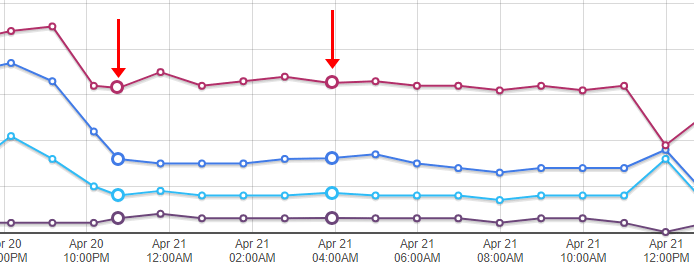
Hovering on a Point on the Graph
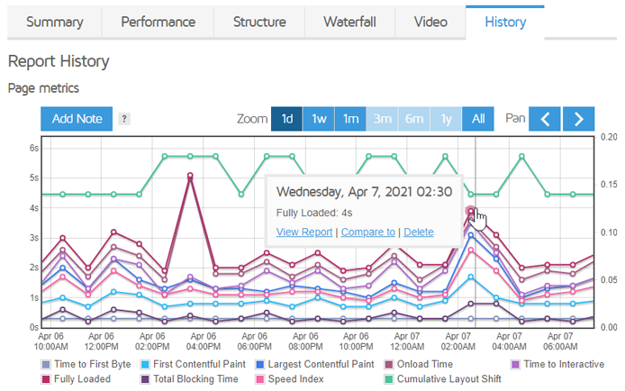
To view a specific report, simply hover over a data point on any History Graph. A small box should pop up showing you when that report was generated, with three options below it.
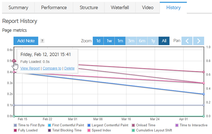
Here’s what happens when you click on any of these options:
- View Report – Opens that particular GTmetrix Report (You can also click on the point itself).
- Compare to – Compares that particular report to the one you’re currently viewing.
- Delete – Deletes that particular GTmetrix Report.
If you have a significant amount of historical data, you’ll instead find cluster points, which contain aggregated data for multiple reports. More on this below.
Loading More Reports
For performance purposes, GTmetrix will only load the first 1000 reports on the History Graph.
The number of reports (i.e., data points) shown on your History Graph will vary according to your plan level:
Basic Users
If you’re a Basic user, you can view up to 50 reports on your History Graphs.
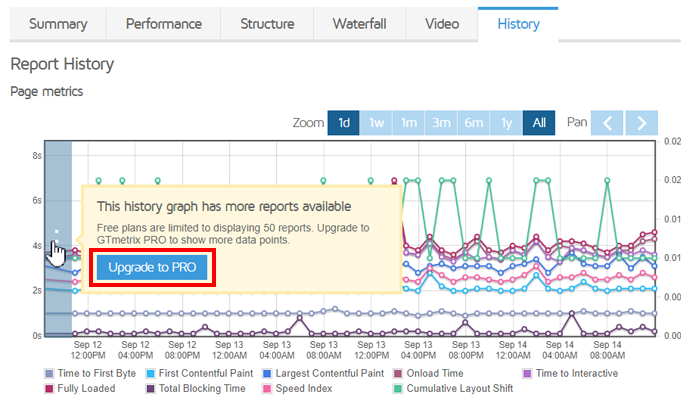
If more report history is available, you’ll see the three dots on the left hand-side of the History Graph. You’ll need to upgrade to a PRO plan to load more reports.
PRO Users
For Micro plan users, GTmetrix History Graphs display the first 100 reports, by default.
For all other PRO users (Solo plans and above), GTmetrix History Graphs display the first 1,000 reports, by default. If more report history is available and you wish to load them, you can do so in one of two ways:
1) Clicking on the Load More Reports Button
Hover over the arrow seen on the left hand side of the History Graph and click on the Load more reports button.
2) Clicking on the Load More History Button
On the History tab of your GTmetrix Report, look for the Load more history button under the History Date Range box. Click on this button to load your entire report history.
History Graph Interaction
Now that you understand the basics of History Graphs, we can discuss History Graph interaction.
Toggling Legends (Page Metrics Graph only)
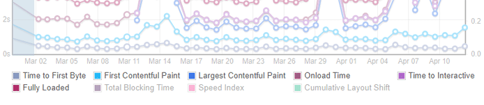
The Page metrics graph shows 9 different metrics. They are:
- Time-to-First Byte (TTFB)
- First Contentful Paint (FCP)
- Largest Contentful Paint (LCP)
- Onload Time
- Time-to-Interactive (TTI)
- Fully Loaded Time
- Total Blocking Time (TBT)
- Speed Index
- Cumulative Layout Shift (CLS)
By default, all the metrics are active on the graph. You can click on any legend item to individually toggle it on or off so that you can choose which metrics you want to view on the graph.
When a legend item is toggled as inactive, it will appear greyed out and that metric won’t be displayed on the graph.
GTmetrix will also remember which legend items are active/inactive for future visits so that you don’t have to repeat this process.
Panning and Zooming
History Graphs are defaulted at the “All” zoom level, which displays your entire report history (or the first 1,000 reports if you haven’t loaded them all).
If you have a significant amount of reports generated for the page, you’ll find that reports may be aggregated into cluster points.
These cluster points have larger circles to indicate the availability of more than one report.
You can hover over any of the cluster points to reveal how many reports are available in that cluster.
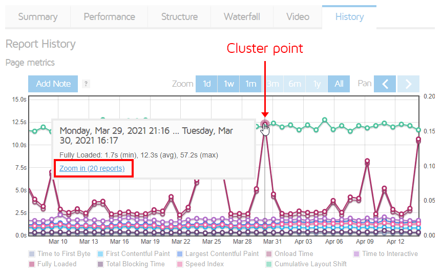
Hovering over a cluster point also shows you the average for that particular metric, along with minimum, maximum and average values.
Click on the cluster point itself or the Zoom in link for a closer look at the reports that were aggregated. You may need to zoom in more than once, depending on how many reports have been generated over that time period.
Once zoomed in, you can use the left and right arrows on the top-right of the History Graph to pan across different areas of the History Graph.
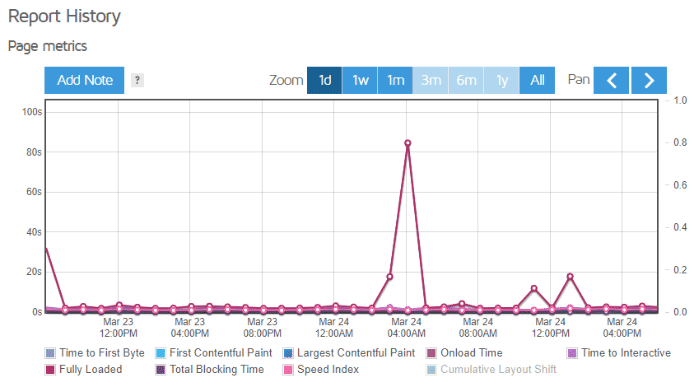
Zooming by Period
You can zoom by a specific period of time by using the Zoom buttons (1d, 1w, 1m, 3m, 6m, 1y, all) above each History Graph.
Each of these buttons represents a specific zoom level that corresponds to a period prior to the latest report.
For example – 1d zooms in on the reports generated one day prior to the latest report; 1w zooms in on the reports generated one week prior, and so on.
Use the pan arrows to move forwards or backwards in date, depending on the zoom setting used.
Click and Drag Zooming
Manually zoom into a specific part of the History Graph by clicking and dragging over any section of the graph.
You can do this multiple times to achieve finer zoom levels.
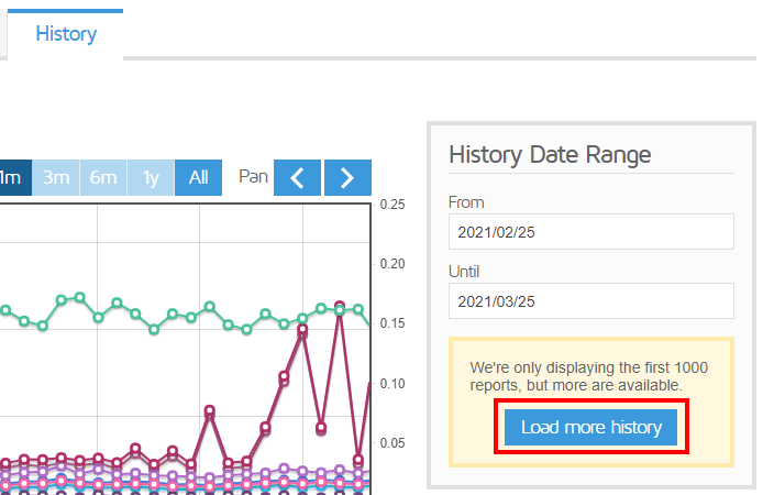
Zooming by Date Range
You can also find specific reports in a given time period by using the History Date Range box in the History tab.
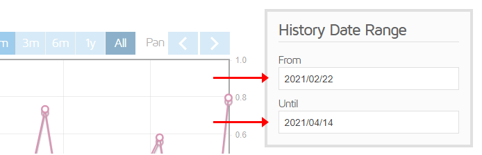
Select the desired “From” and “Until” dates, and GTmetrix will show you all the reports generated during that period.
By default, GTmetrix only displays the first 1000 reports in History Graphs. Click on Load more history* if you want to display the entire report history.
* Select plans only.
Adding Notes
You can add notes to any of the graphs on the History tab. These can be useful to track changes to your webpage’s performance, including fixes, issues, and updates.
To add a note, follow these steps:
1) Click on Add Note on any of the graphs.
2) Click on any part of the graph, where you want to add the note.
3) Type your note into the resulting text box and click on Save.
You can also click on an existing note to edit or delete it.
Added notes will been seen across all History Graphs for that particular report, for convenient tracking.
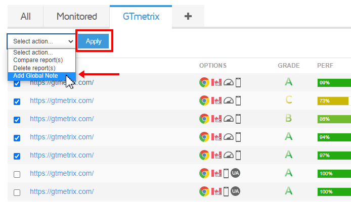
Adding Notes to Multiple Reports (Global Notes)
PRO users can also bulk-add a note to multiple reports at the same time.
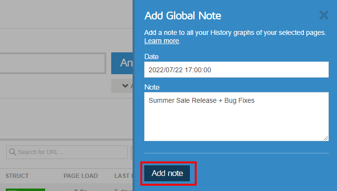
To add a Global Note, follow these steps:
1) On the GTmetrix Dashboard, select the GTmetrix Reports you would like to add the note to.
2) Select Add Global Note from the bulk action dropdown, and click on Apply.
3) Add your text, select the date and time, and click on Add note.
We’ve written a separate guide on using Global Notes.
History Downloads
You can export your report history onto a spreadsheet (in .csv format), either by downloading your historical data in a .csv file, or generating a link to the CSV file (for use with external integrations like Excel, Looker Studio, Google Sheets, etc.).
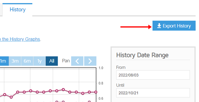
This history.csv file will contain data such as Report generation date (and time), Performance Metrics, Page Details, Browser Timings, etc.
You can select the time range of reports you wish to download, as well as which data columns you wish to display in the .csv file. Read our How to Export Report History guide to learn more.
- Basic users can download historical data for the first 50 reports.
- PRO users can download your entire report history.
Summary
History Graphs are useful for viewing, comparing, and analyzing past performance data, and to keep track of your webpage’s performance history.
Use this guide to learn the different ways you can use these History Graphs, and consider upgrading to a PRO plan if you require longer report data retention or more History Graph visualization.
Get more history visualization and longer data retention
Keep track of your performance history and track trends over time.
Get more history visualization and longer data retention
Keep track of your performance history and track trends over time.
Upgrade to GTmetrix PRO and get more history visualization and longer report retention.