
In Playing With (Fake) Container Queries Chris used the <resize-asaurus> web component to make the elements resizable. Curious to see how that worked I dug into its source.
As I was expecting a truckload of JavaScript to make it work, I was very surprised to see that it basically revolved around using just one single CSS property: resize
The
resizeCSS property sets whether an element is resizable, and if so, in which directions.
Accepted values for resize are none, horizontal, vertical, and both.
To play nice with CSS Logical Properties the values block and inline will also be supported.
😅 Up until then I thought resize was a thing reserved for <textarea> only.
~
# Demo
To get resize working, one must apply it on a block level element + also set overflow to any value but visible. Below is a demo with resize set to both:
See the Pen
Resizable Element (Pure CSS) by Bramus (@bramus)
on CodePen.
Don’t forget to set min-width/min-height/max-width/max-height in case you want to prevent the resizable box from becoming too small/big.
~
# Resizing iframes (and other replaced elements)
A very practical use-case for this is resizable iframe elements: As many embedded CodePen pens are responsive, you want your visitor to be able to resize them.
Could this be a task for CSS resize property you ask? Why yes, but there’s one big problem though: resize and <iframe> don’t play nice together as an <iframe> is a replaced element.
🙋♂️ Replaced Elements?
As per spec:
A replaced element is an element whose content is outside the scope of the CSS formatting model, such as an image or embedded document. For example, the content of the HTML
imgelement is often replaced by the image that itssrcattribute designates.
Apart from the img mentioned in the defintion, iframe, canvas, etc. also are Replaced Elements.
Of course, as with many web things, there’s a little workaround we can use:
- Wrap the
<iframe>in a<div>, and make the<div>resizable. - Have
<iframe>strech along with the<div>‘s dimensions, using Flexbox.
Like so:
See the Pen
Resizable iframe (Pure CSS) by Bramus (@bramus)
on CodePen.
As images also are replaced elements (see above), you need to apply a similar trick to be able to resize them:
See the Pen
Resizable image (Pure CSS) by Bramus (@bramus)
on CodePen.
☝️ Note that I also added an object-fit rule in there, to prevent aspect ratio distortion.
~
# Browser Support
Resize is supported in all major browsers, except for MobileSafari (e.g. Safari on iOS). A shame though, as this once again pushes MobileSafari into the “(Mobile)Safari is the new IE6” corner …
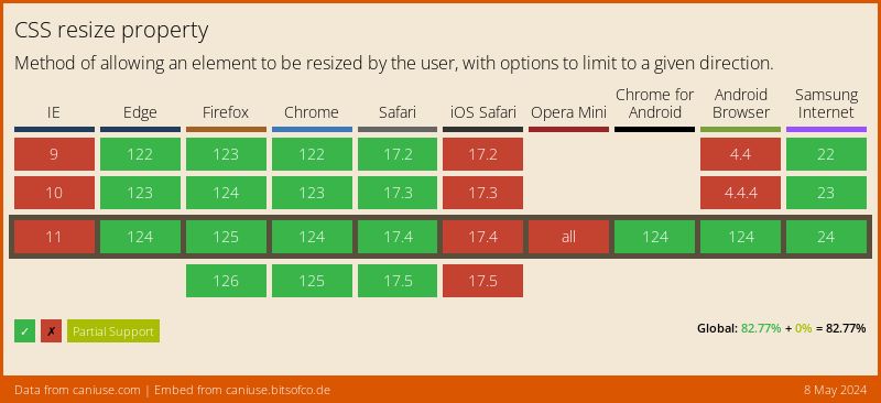
💡 Shown above is a dynamic CanIUse.com image, showing an always up-to-date support table. By the time you are reading this browser support might have become better.
Sidenote: @supports vs. resize: both; vs. MobileSafari
In the demo above I wanted to show a warning in browsers that don’t support resize: both;. For that I tried using @supports, which has proven to be successful before.
.warning {
	display: block;
}

/* Hide warning in case browser supports resize: both; */
@supports (resize: both) {
    .warning {
        display: none;
    }
}
MobileSafari however also hides the warning and thus falsely claims to support resize: both.
I’ve reported a bug on this: https://bugs.webkit.org/show_bug.cgi?id=211994
~
🔥 Like what you see? Want to stay in the loop? Here's how:
Leave a comment