9 New 2020 Browser Features You Probably Didn't Know

As 2020 draws to a close, let’s review nine of the best browser features you need to be using!
The web is continually evolving. As web developers, we know this, and, let’s face it, this is one of the reasons we love our job! 💁🏻♀
So, today I’ll be sharing with you the main nine new features that drew my attention this year.
1. IntersectionObserver V2
The Intersection Observer API allows you to detect when an element appears in the viewport. The original API is supported now by all major browsers.
With the original API, people with “ill intentions” could take advantage of its shortcomings. Mainly because of its inability to detect when an element is occluded (covered) by some content.
To understand what I am talking about, you should see this demo of a video player that fires an ad (that isn’t visible) when clicked on (click on “trick mode” to activate it).
That’s why the new Intersection Observer has been implemented (even though all browsers do not yet support it as you can see here). The main takeaway is that the IO V2 works by tracking an element’s visibility instead of just its presence in the viewport.
Now, I can’t leave you just with this. I prepared a little example that will help you check the difference in implementation from V1 (the commented part) to V2:
<div  class="viewport">
	<div  class="element">before scroll</div>
	<div  class="observed">after scroll</div>
</div>
.viewport {
	height: 200px;
	background-color: blue;
	overflow-y: scroll;
	padding: 16px;
}

.element {
	height: 300px;
	background-color: red;
}

.observed {
	height: 100px;
	background-color: green;
}
// 	// Intersection Observer V1
// 	const logIfIsInViewPort = (entries) => {
// 		for (const entry of entries) {
// 			if (entry.isIntersecting) {
// 				console.log(entry);
// 			}
// 		}
// 	};
//
// const observer = new IntersectionObserver(logIfIsInViewPort);
// observer.observe(document.querySelector('.observed'));


// Intersection Observer V2
const  handler  = (entries) => {
	for (const  entry  of entries) {
		if (entry.isIntersecting && entry.isVisible) {
			console.log(`Visible since ${entry.time}`);
		} else {
			console.log(`v2 not supported, fallback to v1`);
			if (entry.intersectionRatio >  0) {
				console.log("observed element in the view");
				console.log(entry);
			} else {
				console.log("observed element out of view");
			}
		}
	}
};

const  observer  =  new  IntersectionObserver(handler, {
	threshold: [1.0],
	trackVisibility: true, // this will give you the isVisible property
	delay: 100,
});

observer.observe(document.querySelector(".observed"));
You can visualize the console logs in this JSFiddle. 👈🏼
You can find more details on how to use the Intersection Observer V2 in this Google’s features update article.
2. Screen Wake Lock API
Do you use your phone to follow recipes and get super annoyed every time you have to wash and dry your hands to unlock your screen because your screen went idle? 😒
Well, worry no more! The gods of the internet have smiled upon us this summer. 🤗 Screen Wake Lock API is here (well, mostly for Chrome users 😁).
The Screen Wake Lock API provides developers with a way to prevent the screen from turning off, dimming or locking. So far, you could only achieve this in a native app or via hacky and power-hungry workarounds (like NoSleep.js that plays a hidden video on the webpage, but now at least it added support for the Screen Wake Lock API).
Here is how you can use the new Screen Wake Lock API:
let wakeLockSentinel =  null;

const  requestWakeLock  =  async () => {
	if ("wakeLock"  in navigator) {
		try {
			// Detect if Screen Wake Lock API is available
			console.log("Screen Wake Lock API is supported");

			// Enable Screen Wake Lock API
			wakeLockSentinel =  await navigator.wakeLock.request("screen");
			console.log("Screen Wake Lock API is active");

			// Add event listener for when Screen Wake Lock API is released
			wakeLockSentinel.addEventListener("release", () => {
				console.log("Screen Wake Lock has been released");
			});
		} catch (err) {
			console.error(err);
		}
	} else {
		console.log("Screen Wake Lock API is not supported");
	}
};

requestWakeLock();

// Disable Screen Wake Lock API after 10 minutes
setTimeout(() => {
	wakeLockSentinel.release().then(() => {
		wakeLockSentinel =  null;
		console.log("Screen Wake Lock API is disabled");
	});
}, 600000);
A great example has been provided 👉🏼 here by MDN Web Docs. As they explain, their “demo uses a button to acquire a wake lock and also release it, which in turn updates the UI. The UI also updates if the wake lock is released automatically for any reason. There’s a checkbox which, when checked, will automatically reacquire the wake lock if the document’s visibility state changes and becomes visible again.”
3. CSS :any-link Selector
This feature is handy and is available in almost every browser except for Internet Explorer (😒 of course).
What the :any-link CSS selector does is style every <a>, <link>, <area> element in which href is defined.
😃 So for example, here we will end up with just the first link that has the defined style applied to it:
<a href="http://nadarifki.com/">my portfolio</a> <a>not my portfolio</a>
a:any-link {
background-color: purple;
	color: white;
}
4. CSS content-visibility
If you’ve ever worked on heavy content websites with large audiences, you understand how vital page load performance is. It’s an important battleground in web development. This is the reason why this new CSS content-visibility property has launched in Chromium 85.
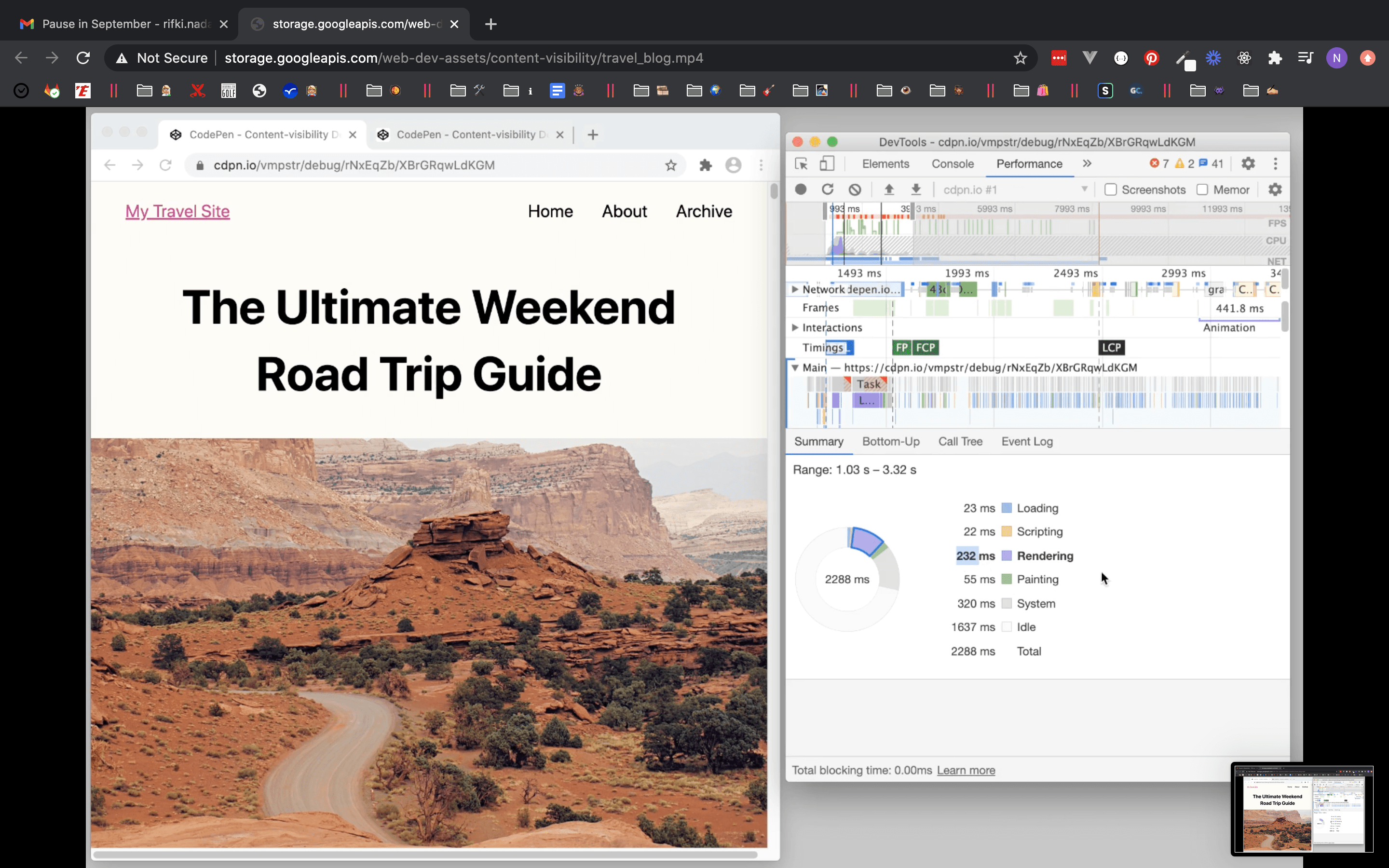
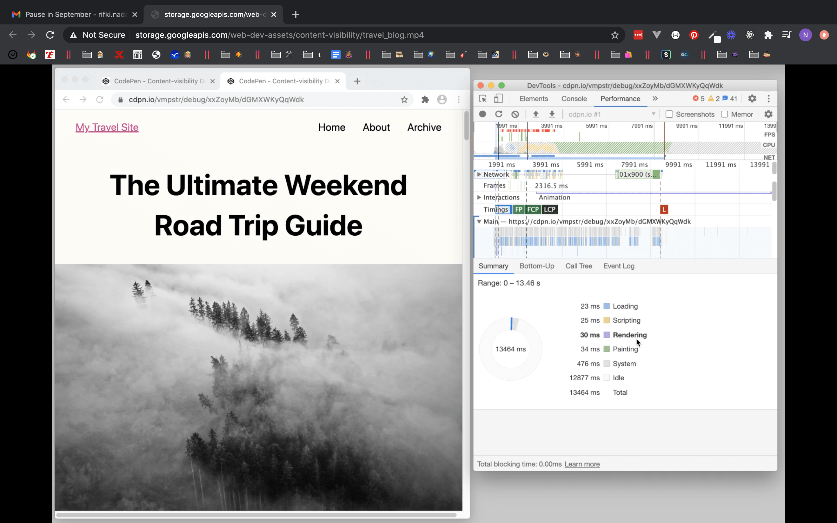
In a nutshell, content-visibility is a CSS property that controls whether and when an element’s content is rendered. 🤔 How does it impact page load performance? By only rendering the content of an off-screen component when it becomes on-screen. This way, the rendering of your off-screen content / below the fold content doesn’t impact the loading of your on-screen content.
There are three values the CSS content-visibility property take:
content-visibility: visible: This does not impact in any way the rending of the element it is applied to.content-visibility: hidden: This is similar todisplay: nonebut different in a significant way ☝🏼 . Adisplay: nonedoesn’t just hide an element. It also destroys its rendering state (which is as expensive as rendering the element performance-wise), whilecontent-visibility: hiddenhides it but keeps its rendering state.content-visibility: auto: This is the most interesting one because it’s the one that permits the browser to turn on and off the element’s visibility based on its presence on- or off-screen. Which can result up to “a 7x rendering performance boost on initial load” according to Chrome Developers as shown in their demo, with a very wide difference in rendering time:

Awesome, right? 👏
5. CSS ::marker Pseudo-element
Remember that time when you just started playing with HTML and CSS, trying to style
<li>items, and you were like, "How on earth isn’t there a way to style something as common and basic as list items?” 😏🙄 We’ve all been through it, and finally, the future generations will not have to wonder about this nor write hacky CSS code to style list items! 🤷🏻♀
How? Simply by using the CSS pseudo-element
::marker:<ul> <li>Yan</li> <li>Ithnan</li> <li>San</li> <li>Four</li> <li>Cinq</li> <li>Roku</li> <li>Ilgob</li> <li>Ocho</li> </ul>ul li { color: grey; } ul li::marker { color: magenta; content: "> "; font-size: 14px; }It is now supported by almost all major browsers, except IE and Opera. ☝🏻 So if you’re using Chrome, make sure your browser is up to date to see the difference in style!
6. URL Scroll-To-Text Fragment
There are some incremental sweet little changes on the web that are just so great! 😻
You already know that you can directly access a section on a page with the id name of the HTML element preceded by
#(like here). 😎 Now you can access any part of a web page through theURL Scroll-To-Text Fragmentfeature (that also highlights the selected section of the page you’re referencing un your URL).This sounds all like gibberish unless I show you. That’s why I’ve prepared this little demo:

So as you can see, I only had to add the
#:~:text=[prefix],[suffix]fragment at the end of my URL, and ended up with this URL:https://www.telerik.com/blogs/author/nada-rifki#:~:text=7,Lifethat opens right at the highlighted element.So cool! ⚠️ Note that
[prefix]and[suffix]refer to how your text starts and ends.👉🏼 Here, check out browser support.
7. Gap Property for Flexbox
If you previously used the grid-gap property in CSS Grid, you probably wondered why this isn’t a thing in Flexbox. 🤷🏻♀ Well now it is (except for IE and Safari)!
You can use the
gapproperty in Flexbox the same way you usegrid-gapin Grid. The only difference is its shortened syntax (that Grid is also adopting now).For instance 👇🏼:
/* To define the same gap for both columns and rows: */
gap: 20px;

/* To define different gaps for colums and rows: */
gap: 20px 10px;

/* To define only your colums gap: */
column-gap: 10px;

/* To define only your rows gap: */
column-gap: 20px:
😜 You can read more about this property here on MDN Web Docs.
8. CSS Revert Value
The
revertCSS keyword changes an element’s style back to the value as if no changes have been made to that element. To do so,revertfollows the cascading value of the property:- first, by checking the user stylesheet;
- then, the browser’s default style;
- finally, if both are missing,
unsetis applied (applyinginheritorinitial).
☝🏼 Mind you, the
revertvalue is different from the CSSinitialbecauseinitialwill ALWAYS change the style value to the default one defined in the official CSS Specification.I find the
revertCSS value useful when, for instance, I am styling an element for mobile, and then I need to revert a specific style value to its origin on desktop (quick and kind reminder 😊 always mobile-first!).You can find great examples that will help you understand better
reverton the MDN Web Docs, and here 👉🏼 you can check out browser support.9. AVIF Image Format
AVIF is a new image format, and this is what you need to know: It is 50% smaller than a typical JPEG image, with higher quality than an equal-weight JPEG image. So, less weight + less pixelation! 🎉
This article is only meant to introduce features and give you a glimpse of their potential use. Plus, I’d instead let this article from the Netflix TechBlog show you, in details and with real-world use cases, the difference between a typical compressed JPEG and AVIF!
Support for AVIF is available for Chrome and Opera, while for Firefox browsers, implementation is underway. 😜 So keep a lookout for the evolution of this new image format browser support.
In the meantime, you can start using this new format by simply providing an alternative image if support for AVIF is unavailable:
<picture>
	<source  srcset="image.avif"  type="image/avif" />
	<img  src="image.jpg"  alt="Alt text" />
</picture>
I hope you found these useful, and if there are other new features you know, let us know in the comments, or you can also reach out to me on Twitter @RifkiNada or see my work at NadaRifki.com. 😜

Nada Rifki
Nada is a JavaScript developer who likes to play with UI components to create interfaces with great UX. She specializes in Vue/Nuxt, and loves sharing anything and everything that could help her fellow frontend web developers. Nada also dabbles in digital marketing, dance and Chinese. You can reach her on Twitter @RifkiNadaor come on her website, nadarifki.com.
