
By Rachel Opperman
10 Foolproof Tips for Maximizing Website Accessibility

When building a website, it can be easy to lose track of the user experience for the full range of people that may use it.
Consider this. According to the CDC, one in 4 adults has a disability (mobility, cognition, hearing, vision, independent living, self-care).
Without question, people that use our apps and websites are going to fall into that category. The microdecisions we make with our code can result in a huge difference to our users. For example, if you can use a mouse or trackpad, you may think it's okay to remove those "ugly" focus outlines. Or, if you can see an icon button, you may not realize that its lack of text content is a problem. But both of those little things cause big problems for people with disabilities. The good news is that making a website accessible for everyone doesn't have to be hard. In this post, we'll discuss 10 foolproof tips that, when implemented, will improve the accessibility of your website.
TL;DR
- Give icon buttons an
aria-label. - Give every form element an associated
<label>. - Don't remove focus rings.
- Don't use CSS to reorder HTML elements.
- Don't rely on color alone to convey information.
- Use an empty
altattribute for decorative images. - Don't skip heading levels.
- Place meaningful text inside of links.
- Use relative units for text size.
- Allow users to zoom.
aria-label.
A <button> element always attempts to compute its accessible name using its text content. This is an issue with icon buttons, which typically don't have any text content. When an icon button is the focus of a screen reader, the only information conveyed to the user will be "button".
Giving the <button> an aria-label attribute will provide an accessible name that can be read by a screen reader.
Inaccessible code
<button type="button">
  <svg
    xmlns="<http://www.w3.org/2000/svg>"
    fill="none"
    viewBox="0 0 24 24"
    stroke="currentColor"
  >
    <path
      stroke-linecap="round"
      stroke-linejoin="round"
      stroke-width="2"
      d="M7 16a4 4 0 01-.88-7.903A5 5 0 1115.9 6L16 6a5 5 0 011 9.9M9 19l3 3m0 0l3-3m-3 3V10"
    />
  </svg>
</button>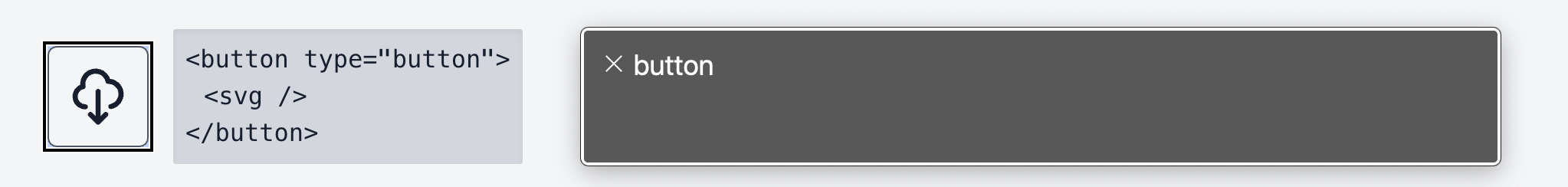
As can be seen on the right, when this button is focused by the keyboard, the screen reader output is simply "button". This doesn't provide nearly enough information to the user.
Accessible code
<button
  type="button"
  aria-label="Download file"
>
  <svg
    xmlns="<http://www.w3.org/2000/svg>"
    fill="none"
    viewBox="0 0 24 24"
    stroke="currentColor"
  >
    <path
      stroke-linecap="round"
      stroke-linejoin="round"
      stroke-width="2"
      d="M7 16a4 4 0 01-.88-7.903A5 5 0 1115.9 6L16 6a5 5 0 011 9.9M9 19l3 3m0 0l3-3m-3 3V10"
    />
  </svg>
</button>
When the button is given an aria-label attribute, the screen reader is able to provide more context about the button. The user will know what the button does.
If you want to test this out for yourself, you can visit the demo site.
Give every form element an associated <label>.
Form labels are essential for accessible forms, but for stylistic reasons, they're often left out or removed. This is a common accessibility anti-pattern because labels serve two purposes:
- The label text can be a click target for the form element.
- The label text is the accessible name of the form element (i.e., when a form element is focused, a screen reader will read the label text).
A <label> can be associated with a form element in one of two ways:
- Place the form element inside of the
<label>element. - Use the
<label>'sforattribute to refer to the form element'sidattribute.
It's important to note that placeholder text on its own is not a viable solution for the following reasons:
- It's not picked up by a screen reader.
- It usually doesn't have a good enough color contrast ratio for users with color perception deficiencies.
- Once the user starts typing in the form input, it disappears.
Inaccessible code
<!-- No label -->
<input type="checkbox">Receive promotional offers?</input>

<!-- The label isn't associated with the input -->
<input type="checkbox"></input>
<label>Receive promotional offers?</label>
Without an associated label, a screen reader can only tell the user that the focused element is a checkbox and that it's unchecked. The user won't know the purpose of the checkbox.
Accessible code
<!-- The input is inside of the label -->
<label>
  <input type="checkbox">Receive promotional offers?</input>
</label>

<!-- The label's for value matches the input's id value -->
<input id="promo" type="checkbox"></input>
<label for="promo">Receive promotional offers?</label>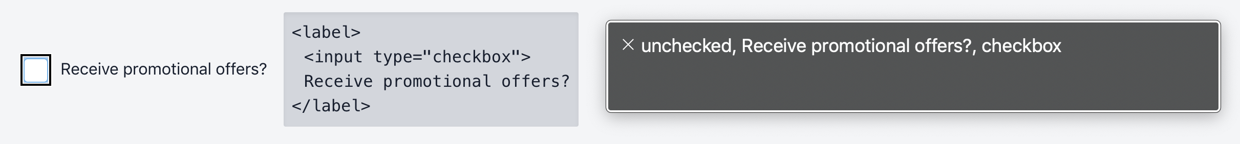
Providing the checkbox with a properly associated label allows the screen reader to tell the user what the checkbox is for.
If you want to test this out for yourself, you can visit the demo site.
Don't remove focus rings.
The focus ring identifies the currently focused element on the page, and it's extremely important for keyboard-only users because it acts as a stand-in for their mouse pointer. Removing this indicator with CSS is a very common accessibility anti-pattern.
Instead of removing the focus ring entirely, style it to your liking using the :focus pseudo-class. The following are some general guidelines for effective focus indicators:
- It has good color contrast.
- It has a complementary shape and size to the element.
- The color scheme is complementary but also stands out.
- It should be visible on older browsers.
- It should be the same across browsers.
Inaccessible code
<label for="username">Username</label>
<input
  id="username"
  type="text"
  placeholder="Username"
>
#username:focus {
outline: none;
}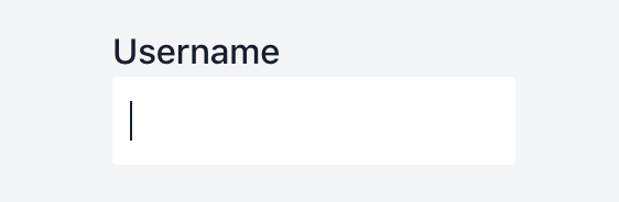
This form input is currently focused, but without a focus indicator, that's not immediately apparent. The position of the cursor is the only clue here.
Accessible code
<label for="username">Username</label>
<input
  id="username"
  type="text"
  placeholder="Username"
>
#username:focus {
box-shadow: 0 0 0 3px rgba(118, 169, 250, 0.45);
}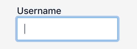
The focus indicator on this input makes it much more obvious that the input is the currently focused element.
Don't use CSS to reorder HTML elements.
With CSS, it's very easy to reorder a website's content. For example, Flexbox could be used to reorder the links in a navigation menu. However, this is a bad accessibility practice because the tab order will still be the order in which the elements appear in the HTML, so the focused element could be jumping all over the page, rather than going in a logical order. Therefore, if content has to be rearranged, change the order of the elements in the HTML, not with CSS.
Don't rely on color alone to convey information.
Most people with color perception deficiencies can see some or most colors, but have difficulty differentiating between certain colors — reds and greens (this is the most common), browns and oranges, and blues and purples. A screen reader, of course, doesn't perceive color at all. Therefore, information that is conveyed by color alone will not be conveyed well or even at all.
For example, if a form input is outlined in red in order to indicate that its value is invalid, but no error message is provided, a screen reader user will have no idea that there's an issue, and a color deficient user could also miss out on that information.
Links are another good example of elements that need additional indicators. An active link should be denoted by more than just a different color (e.g., it could also be underlined).
Use an empty alt attribute for decorative images.
Decorative images are those that don't add any information to the page's content. For example, the image may provide information that is already provided by adjacent text, or it may just be used to make the page look better from a visual perspective. These images should be given an empty alt attribute (alt="") so that they can be ignored by assistive technologies. For example, there's no point to having a screen reader announce "customer service icon" for this image:
The text below the image is what provides information to the user. The image itself is purely decorative, so providing alt text for it would do nothing but add clutter to screen reader output.
Another example would be a logo image. Having a screen reader announce “Zaengle logo” wouldn’t provide any useful information to the user, so such images should also be given empty alt text.
It's also important to note that you cannot leave out the alt attribute entirely, because when it isn't provided, some screen readers will announce the file name instead of the image.
Don't skip heading levels.
Screen readers have commands that enable quickly jumping between headings, and a survey found that screen reader users will typically navigate an unfamiliar page by exploring the headings. Therefore, headings should be used to create a structural outline of the page — the goal is to create a scaffold of the page that allows anyone navigating by headings to form a mental picture of it.
Skipping heading levels in order to use the browser's default heading styles so as to closely match a design is a common accessibility anti-pattern. It's problematic because it breaks the outline model that screen reader users utilize. To avoid this problem, use headings in their proper order and style them with custom CSS.
Inaccessible code
<h1>Company Name</h1>
<section>
  <h3>Section Heading</h3>
  <h5>Subsection Heading</h5>
</section>
Accessible code
<h1>Company Name</h1>
<section>
  <h2>Section Heading</h2>
  <h3>Subsection Heading</h3>
</section>
Place meaningful text inside of links.
Like buttons, links get their accessible name from their text content, which means that you have to carefully choose the text you put inside of them. It's best to use meaningful text, rather than filler words like "click here" or "read more". Using meaningful text will be especially helpful to screen reader users because some screen readers offer shortcuts that will list all of the links on a page. If links contain filler text, such shortcuts become ineffective.
Inaccessible code
<p>
  We have lots of great products.
  <a href="/products">Click here.</a>
</p>
Accessible code
<p>
  We have lots of great products.
  <a href="/products">View what we have in stock right now.</a>
</p>
Use relative units for text size.
If a user with a vision deficiency updates text size preferences in the browser, it's essential that the text on the page updates accordingly. If text is sized in px, the page copy will not update when the user updates his/her browser's text size preferences. To prevent this issue, use em or rem for text size instead of px.
Inaccessible code
h1 {
  font-size: 20px;
}
Accessible code
h1 {
  font-size: 1.2rem;
}
Allow users to zoom.
Users with vision deficiencies may also zoom in so as to more easily read the page content. The viewport meta tag, which is placed in the <head> of an HTML file, should be configured such that zooming is permitted.
Inaccessible code
<meta name="viewport" content="maximum-scale=1, user-scalable=no">Setting maximum-scale=1 and/or user-scalable=no will prevent zooming, so both settings should be avoided.
Accessible code
<meta name="viewport" content="width=device-width, initial-scale=1">Configuring the viewport tag in this way serves two purposes:
- Setting
width=device-widthmatches the screen's width in device-independent pixels. - Setting
initial-scale=1establishes a 1:1 relationship between CSS pixels and device-independent pixels.
Wrapping up
Making a website accessible doesn't have to be hard. Sure, there are certain things that can require a bit more effort (which we'll be discussing in future posts, so stay tuned), but the majority of a website can be made accessible by following the 10 tips presented in this post. These tips are easy to apply whether you're using static HTML or something more complex, like a frontend JavaScript framework. The important thing to keep in mind is that you can't build websites in a vacuum — not every user will experience the site the way that you will. If you remember that while you're building sites and you apply these accessibility tips, the end result is a site that everyone can use.
If there are any accessibility topics you'd like us to cover, or tutorials you'd like to see, let us know @zaengle. You can also sign up for our newsletter to read more about accessibility.
Want to read more tips and insights on working with a website development team that wants to help your organization grow for good? Sign up for our bimonthly newsletter.

Engineer
What happens when you cross years of study in biology and medicine with a degree in computer science? You get someone like Rachel.


